HPI Chorus
Have you ever wondered what housing price indices would sound like if they were converted to music? Planet Money already answered that. But what if that music was worse? In this post, I’ll look at the result of converting state-level Housing Price Indices into music for each of the 50 states. Also, I’ll combine the HPI by region to get a sort of HPI chorus.
Background
Over the past few years, I’ve listened to a pretty good chunk of the Planet Money catalog. Although I’m nowhere near going through the whole show, I don’t think it would be healthy for me to listen to all of it, since back in May, Planet Money released their 1000th episode. Their 1000th episode was essentially a “Planet Money episode about Planet Money,” in which they explained how a Planet Money episode works by breaking it down into its component parts. To do this, they used examples and audio clips from the show’s entire run. At one point, they described how they explained the graph of the Case-Shiller Home Price Index on the radio. Because they obviously couldn’t show the listener a graph of the index, they converted graphs for several HPIs into music, and had an opera singer perform the result. Although I wouldn’t exactly call the resulting music “great,” it certainly succeeded in conveying the sense of the original graphs.
As often happens when I get introduced to something like this, I had an urge to do something similar, but I wanted to elaborate on it a bit – and this post is the result. Instead of hearing just one singer singing a single region’s HPI, I wanted to hear lots of regions, all at the same time. I also wanted to play around with sheet music generation. I’m not a very good musician, and I really don’t understand music theory, but neither of those facts ended up mattering for this exercise. 🙂
In this post, I’ll consider the state-level FHFA All-Transactions House Price Index as opposed to the Case Shiller HPI. Data were sourced data from FRED using the datapungi_fed FRED API wrapper. I hacked together some tools to convert the indices into musical notes and exported the result as sheet music using Abjad and LilyPond. Since I didn’t have an opera singer to perform the results for me, I auto-generated WAV audio files using Numpy, with notes played as simple localized sine-wave packets (which kind of sound like a pipe instrument). I generated audio and sheet music for each of the 50 US states, which you can see and listen to here. Finally, I grouped states by census region and averaged their audio files to produce a sort of HPI chorus for each census region, which you can find here. Code to replicate the whole process is provided in this git repository.
What is an HPI?
Before moving on to converting HPI into music… it would probably be a good idea to mention what we’re actually even looking at / listening too. As explained on FHFA.gov
The FHFA HPI is a broad measure of the movement of single-family house prices. The FHFA HPI is a weighted, repeat-sales index, meaning that it measures average price changes in repeat sales or refinancings on the same properties.
So, an increase in an area’s HPI indicates that houses in that area are getting resold for more than they used to, while a decline indicates that houses are reselling for less.
The state-level HPI which we consider in this post have all been indexed to a reference level of 100 in 1980 (i.e. each curve passes through 100 in 1980). As such, you can’t directly compare these HPI to assess whether houses are more expensive in one state than another (you’d need to know what housing prices were in every state in 1980 in order to do that), but these HPI do indicate how much housing prices have increased within a state over time. On the other hand, comparing across states does give a sense of the relative change in housing prices which each state has experienced.
HPI Music For Each State
The graph below shows the HPI for a single state, which can be toggled by the drop down. Below the graph is a transcription of the HPI into sheet music, and below that is an audio player which should let you listen to the result. For sake of comparability, I have used the same acoustic range for each state.
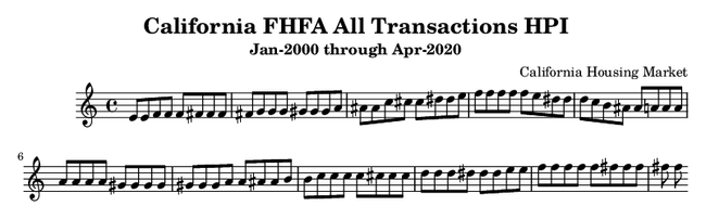
Some of the most interesting states to look at / listen to are the states which were heavily impacted by the housing market bubble, such as California, Florida, Arizona, and Nevada. In those states, you’ll hear a steady increase for the first few seconds (corresponding to the pre-recession housing bubble) followed by a decline for a few seconds (once the bubble bursts), ending with an increase toward the end (for the recovery). This trend is essentially present in all of the state-level HPI, but is most dramatic for states like these.
Regional HPI Chorus
Combining HPI within a region can give a sense of the housing markets there. Although it probably makes more sense to compute the HPI for the region as opposed to comparing state-level indices, I think being able to listen to multiple indices simultaneously is a bit more interesting than just listening to a region’s HPI.
Listening to the different regions (or reading the graphs), the Midwest and South tend to have a lower pitch than the West and Northeast, indicating that housing prices for states in these regions have generally increased less over time. Also, except for the Midwest, each region has at least one outlier state which grew much more rapidly than the other states in the region. These outliers can be heard singing out above the rest in a slightly higher register than the others.